The embrace
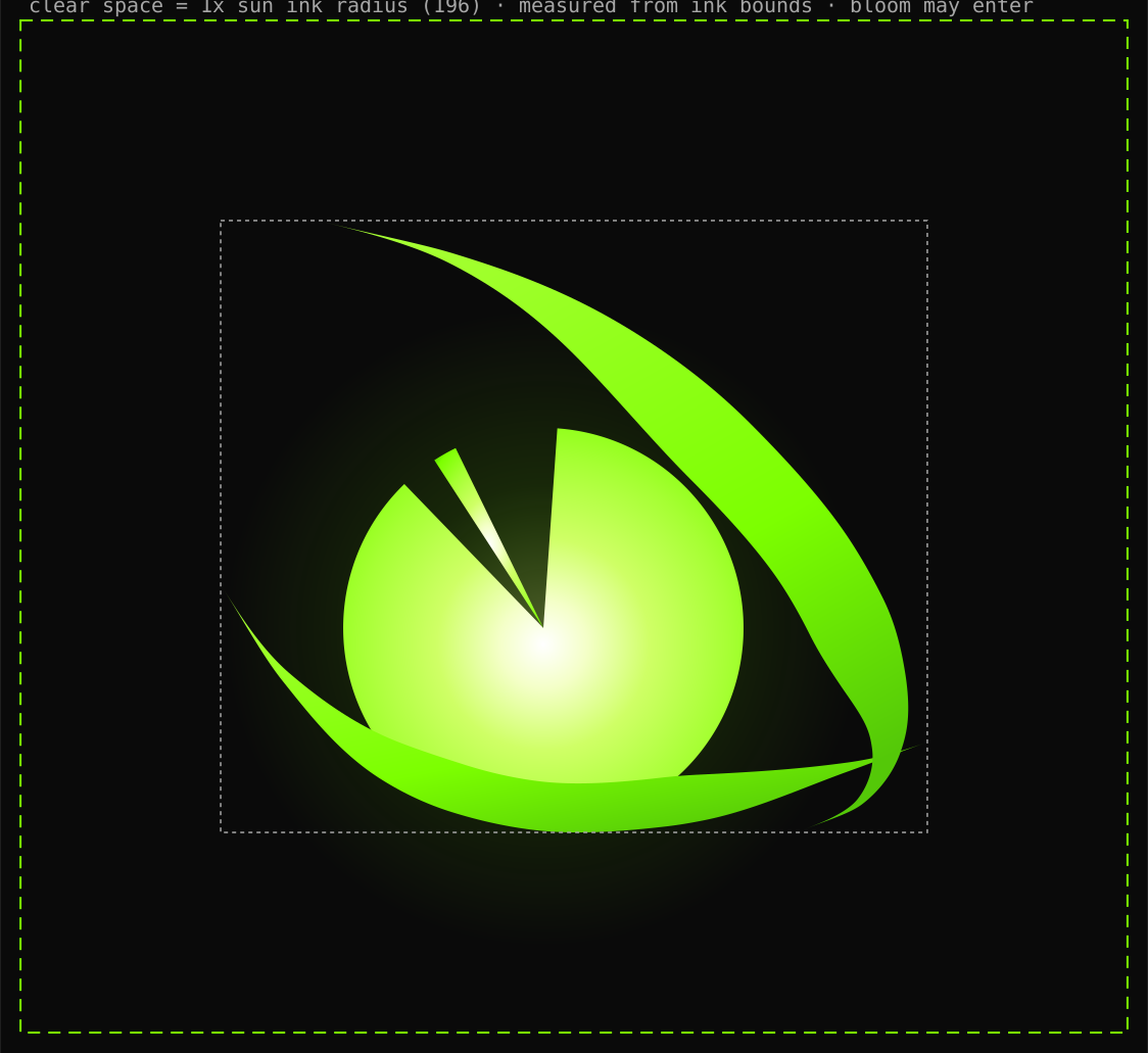
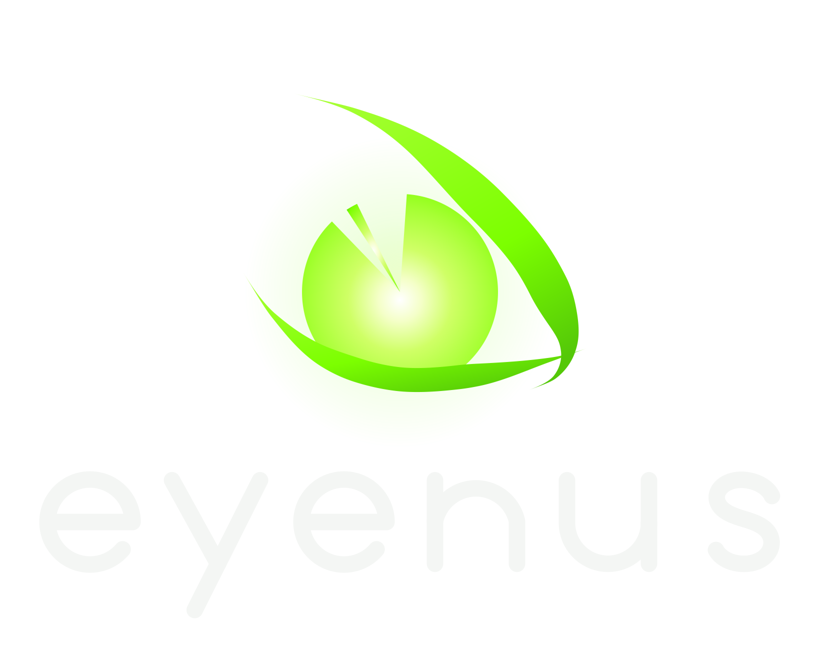
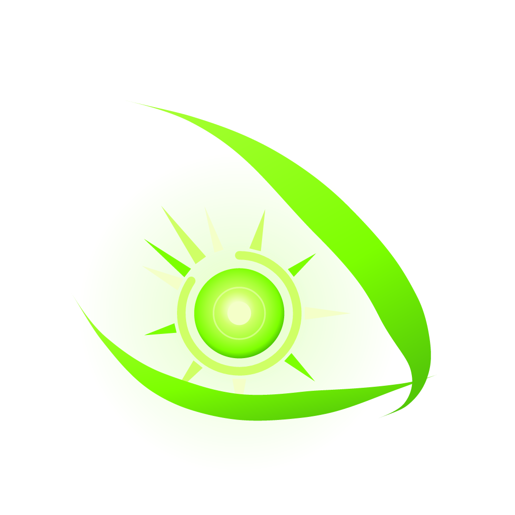
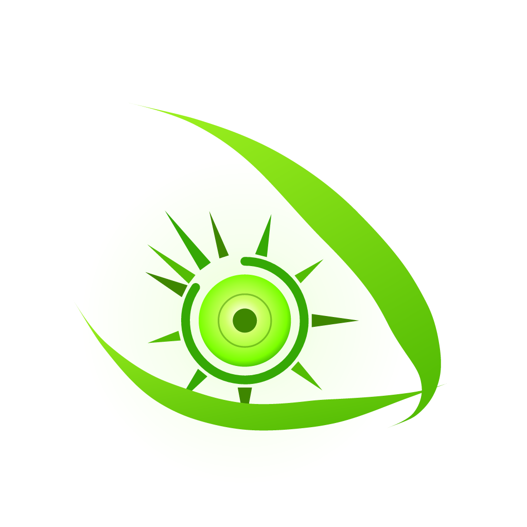
The eye does not contain an iris. It embraces a sun.
The subject of the mark is not the eye — it is the relationship: an eye that shelters, focuses, and is lit by the thing it holds.
Before anything can be seen, something luminous must cross a distance and arrive.
It captures reality — light, edge, motion — and understands none of it.
An image arrives inverted, unlabeled, meaningless. Capture is not comprehension.
Nus is not the nerves. It is the invisible lattice where signal becomes pattern, pattern becomes memory, and memory becomes meaning.
Nothing about understanding is visible. It happens in the dark, between the points of light.
EYENUS
SUN · EYE
The beginning was hidden in the ending.
Not the origin of the name — a reflection of the philosophy. Everything the eye will ever understand began as light.
Every Eyenus product, present and future, lives somewhere on this line.
Sun
The origin. Light has a source.
Light
Everything begins by arriving.
Eye
Capture without comprehension.
Perception
The world becomes signal.
Nus
The network between seeing and knowing.
Understanding
Signal becomes meaning.
Intelligence
Meaning compounds and learns.
Illumination
Intelligence returns light to the world.
The eye does not contain an iris. It embraces a sun.
The subject of the mark is not the eye — it is the relationship: an eye that shelters, focuses, and is lit by the thing it holds.
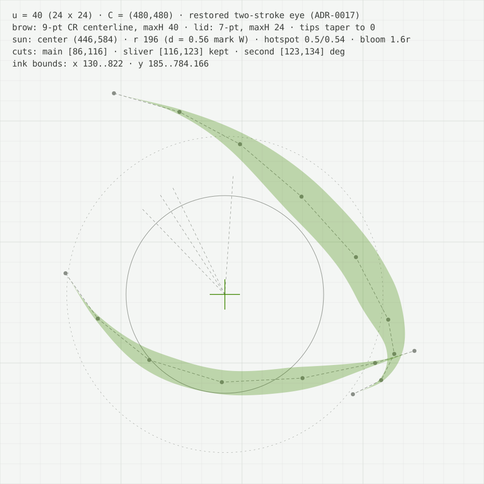
Two calligraphic strokes — a brow whose thin tip is the mark’s highest point, a lid that rises to close the corner — drawn in one motion each.
The eye stays open around a complete solar source. Its core sits on the optical axis while the released rays carry illumination outward.
An emission core, optical ring, interrupted corona, and eleven structural rays make the sun a complete radiant source.
Three release rays turn toward the eye’s open side: illumination moving from origin into the world.
Human vision is most sensitive at the center of the green spectrum. Green was never a preference — it is the color seeing sees best. It has been the color of Eyenus since 2005.
In 2005, Eyenus drew a green eye with the tools of its decade. Twenty years on, the same eye remains — the gloss traded for light, the geometry measured rather than guessed. Wiser, not reinvented.
Space Grotesk carries display, Inter carries text, JetBrains Mono carries data. The wordmark is drawn, never typeset.
Seeing, understood.
Eyenus builds instruments of perception.
color.brand.signal
One green family on graphite, measured — not guessed. The 2005 lime survives as color.heritage.lime, the provenance of everything green here.
Declarative, calm, precise. Short sentences. No exclamation marks. Confidence through restraint.
Real light in real space: lens flare, dawn, long shadows. Never stock-blue “tech.”
Direction — no imagery shipped yet.
Geometry first: strokes and light on deep space, drawn from the mark’s own vocabulary.
Light behaves; interfaces don’t dance. Breathe (7s), illuminate (once, on arrival), travel (signals along paths). Durations and easings come from the motion tokens.
duration.instant · fast · base
duration.slow · slower
Calm surfaces, visible focus, 44px targets. Motion is always optional — reduced motion is a first-class design, not a fallback.
The U-grid: U = 40 on the 960 canvas. Page rhythm comes from the space tokens, never improvised.
Stroke icons on the mark’s stroke logic: 24-grid, 2px stroke, round caps.
Clear space is one sun radius on every side. Minimum size 32px (below that, the favicon law applies). Colorways per theme. The mark is never rotated, recolored, outlined, or given an iris.
Four violations, rendered from the real geometry — and the one correct mark.
SVG masters, the PNG set, and the favicon pack — regenerated from the canonical sources at every build, never hand-edited.
On-dark assets are transparent and carry light ink — place them on dark surfaces only. On-light assets are the counterpart for white and paper.
Understanding is the purpose.
Light returns through intelligence.
The identity, as a working system.
Explore the Brand Laboratory